Ticket Tictac
Movie ticket app
Time Feb 2022 -Jul 2022
Duration 6 months
Role UX/UI Designer
Tools Figma, Adobe Illustrator
Project Brief
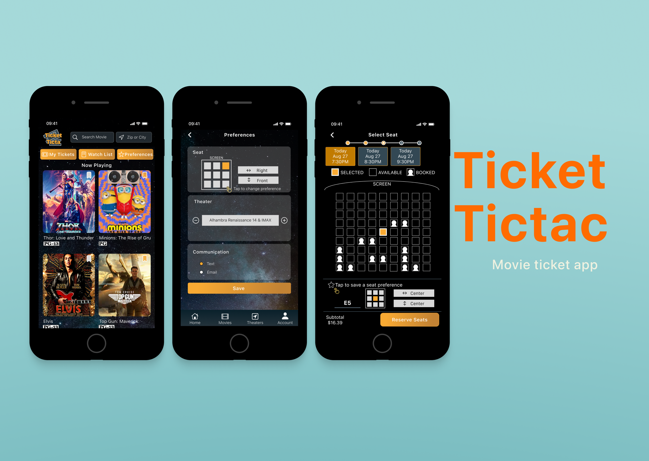
On Ticket Tictac app, users can get movie tickets ahead of time and secure the best seat by using less time and steps.
Final outcome
Main challenges
Before I dig into more detail about this project, I see there are some challenges in the movie industry. Alternative film content providers like Netflix and Disney+ are putting pressure, and traditional movie theaters will need to respond to these developments more quickly than before.
Although optimization of the application itself will not bring about massive changes to the industry, establishing a clear visual hierarchy can help users experience a service in an organized, systematic way.
Where did I start
Competitive Audit
I started by conducting a competitive audit to find if there is any potential problems that I can solve. I compared the purchasing experience of our competitor’s web & app, I found most of them have a well-designed flow that users can buy a movie ticket on their devices. However, some of them do not have a clear color scheme and art direction which could make users feel frustrated and confused.
Design principles
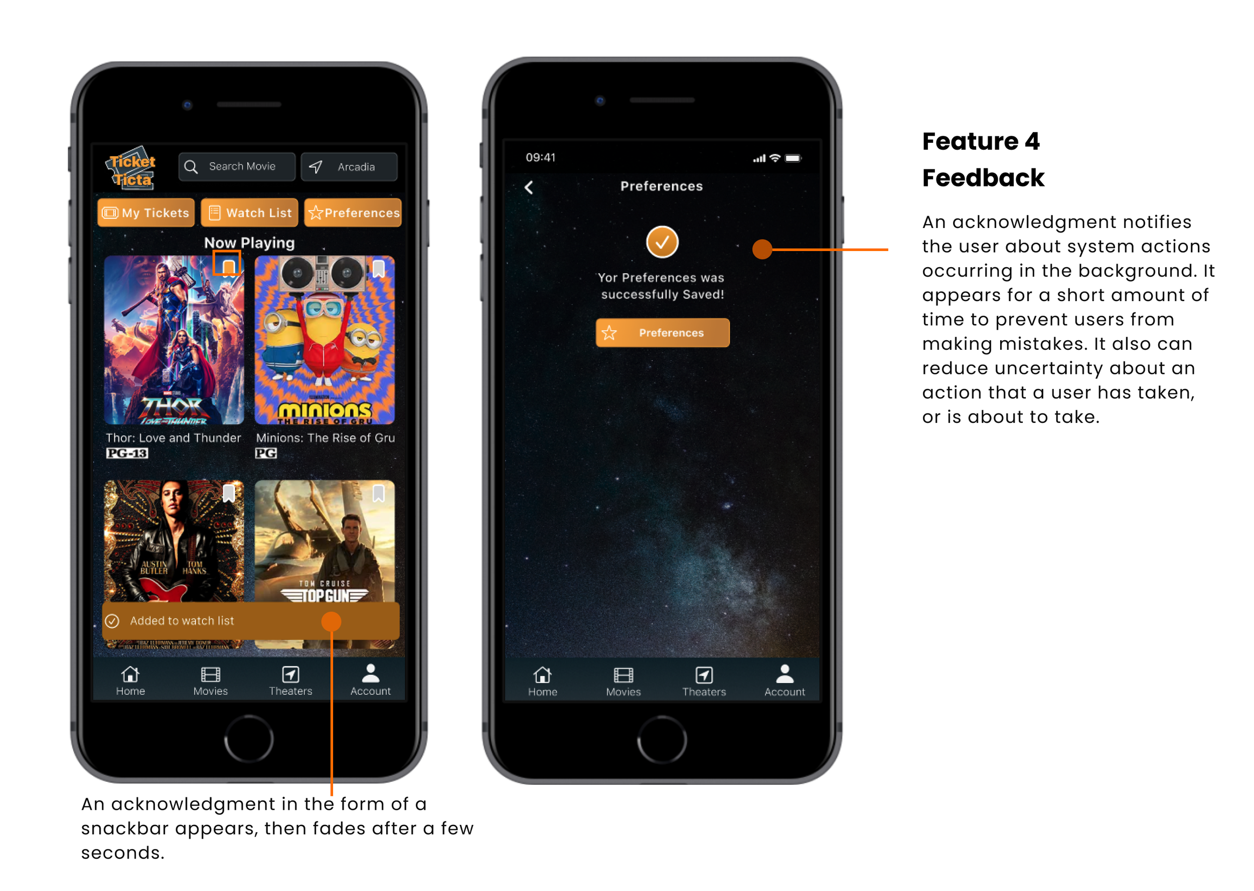
In order to make sure the user flow of buying tickets is simpler and more intuitive, I established 3 design principles to maximize impact and reach. These principles are also what I want our users to portray Ticket Tictac as a brand, which are Aesthetic integrity, Consistency, and Feedback.
Represents how well an app’s appearance and behavior integrate with its function.
Aesthetic integrity
Implements familiar standards and paradigms.
Consistency
Acknowledges action and shows results to keep people informed.
Feedback
Potential problem
Even though users almost never notice a good visual hierarchy, a bad one will jump out for its confusion and difficulty. After conducting a competitive audit, I identified some key features that could be used to make the purchase experience more smooth. I also found there were some improvements that I can make to keep an overall style, optimize information density, and respect the needs of the particular screen.
Goal
I set goals at the beginning to make sure I will always align with core values.
Decrease time on selecting seats & theater
Based on previous order history and preference, provides users with a better and easier experience to select seats.
Increase in booking & revenues
Making the whole booking process smooth and clear so users could buy tickets without frustration.
Design process
Early ideation
Based on the early research, my role as a UX designer is to understand these pain points and come up with ideas to solve them. To expand my understanding of people I’m designing for, I would like to use personas, user stories, user journey maps, and user flow to identify pain points the user might experience.
Persona
I used personas to identify patterns of behavior in users. These patterns point to a common pain point that a group of users experiences.
Candace: A busy office worker who only has time to buy ticket during her lunch break.
Ignacio: A retired actor who has a problem with using movie app to buy tickets and check watchlists.
Storyboard
Using storyboard as a tool to visualize potential solutions to problems that the user is facing. I want to include emotion in our big picture storyboard, so I could focus on how will the user use our app. Why will it be helpful? And why will the user be delighted by the app? In the close-up storyboard, it is more useful to focus on the details of the product.
Scenario: Use the Ticket Tictac app to get movie tickets ahead of time and secure the best
Journey Mapping
Using journey maps to help me understand the challenges a user may face when trying to use Ticket Tictac.
User Flow
To be more specific, I outlined the user flow before I started to design because it can help to picture how users will move through the app and What screens will users experience after taking action or making a decision.
Sketch
Based on user research and brainstorming, quick and dirty sketches were created at the pre-design stage. My focus at this stage is to diverge first, converge later.
Test ideas with prototype
Wireframe & prototype
This is what the early wireframes looked like. I map out the whole process of buying a ticket, identify the purpose of each section, aligning it with the design principles-Aesthetic integrity, Consistency and Feedback.
Testing
I conducted unmoderated user tests with 5 people by using Maze’s Survey tool. Through the useability test, I want to find out if the main user experience, finding movie and buying a ticket, is easy for users to complete. I’d also like to know where users might be getting stuck in the purchasing process.
The first usability test showed:
60% of users were confused when they were choosing a date and time.
60% of users skipped filling in their information. Only 40% of participants used the guest check-out feature and choose to check out as a guest.
40% of users had trouble adding a payment method.
The average duration for selecting a seat was 14.14 secs, and all the participants spent more than 10 secs.
Research finding
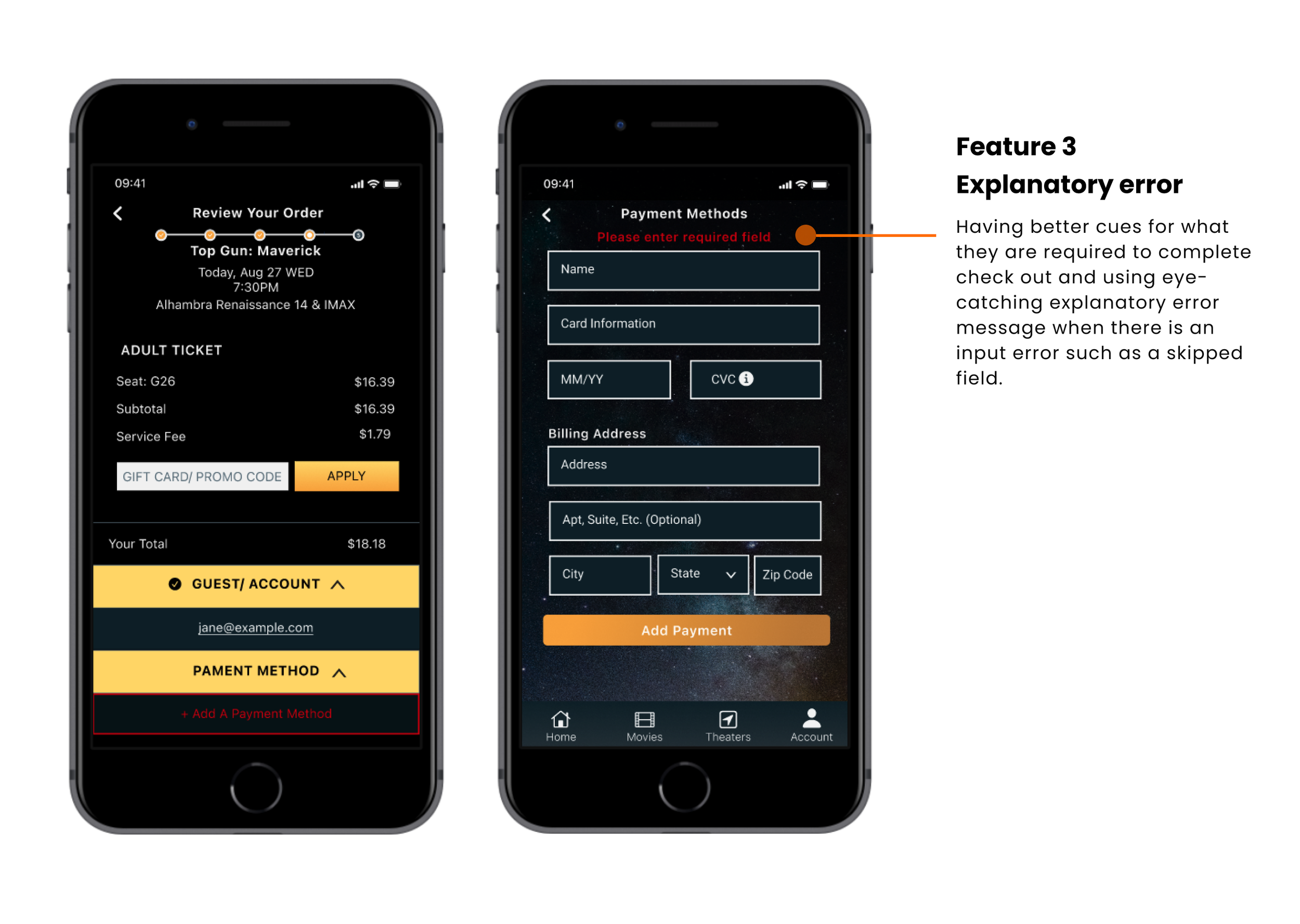
Based on the usability test, I adjusted some layouts and added highlights, explanatory error messages, and cues to help users to complete checkout. After the 2nd round of testing, I ensured it solved the problems that users were easy to ignore the Guest/Account and Payment feature and also can benefit users who didn't have experience with buying a ticket on the app. I also identified some key features that could be used to smooth the purchase process.
How Might We
Challenges and breakthrough
For the pain point: users always spend too much time selecting a seat is more tricky. We need to define our problem statement to turn our challenge framing into a question that can be solved. So Here comes our main problem statement: How might we decrease time on seat selection and secure the best seat for users? To achieve the first goal of decreasing the time on selecting seats and helping users find a seat with the best view, I came up with some ideas:
Opportunity 1: Giving a suggestion depends on what kind of seats are most popular.
Opportunity 2: Helping the user pick a seat according to their previous order history and preference.
Opportunity 3: Building seat views or 3d views to see virtual in-seat views before purchasing ticket.
Interview and Testing
I wanted to learn more about what concerns users have when they are choosing a seat, so I conducted interviews with 5 people. During the interviews, I recorded and took notes to save and revisit the information that I gathered from all participants.
The result showed:
80% of subjects have a preference when they are choosing a seat.
60% of subjects mentioned if the app could remember users’ actions and preferences is a great way to create a positive experience.
According to what I gathered from interviews, I created prototypes to test again and see how they work. Based on the results, ended up I chose Solution 2. Simple things can make a big difference—the difference between a product your users tolerate and one they love. An app that makes effective use of its memory is more like that self-motivated assistant, remembering helpful information and personal preferences without needing to ask. I believe if we enable our products with an awareness of user behavior, memory, and the flexibility to present information and functionality based on previous user actions, we can have great advantages in user efficiency and satisfaction.
Final Design
Here's my deliverable, but since you're probably not going to read through it, here's a summary.
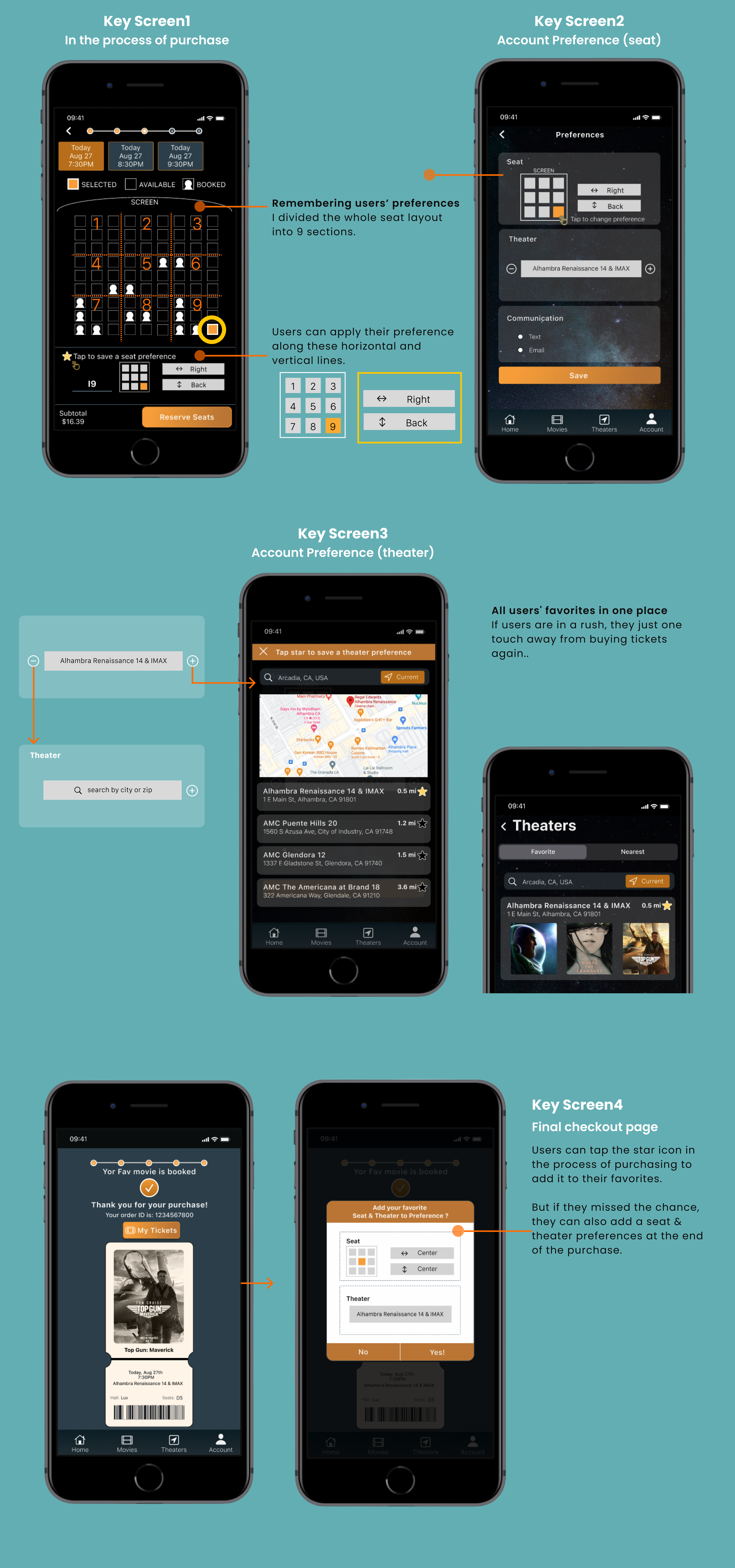
Guided by the principle of task coherence, I developed a system that leverages users' past seat selections to anticipate their future choices. This concept stems from the understanding that human thoughts and behaviors exhibit consistency over time. By reliably predicting users' behavior based on their past interactions with the application, I significantly streamline the user experience. This approach minimizes the number of inquiries the application needs to make, thereby reducing average task completion time.
UI Animation
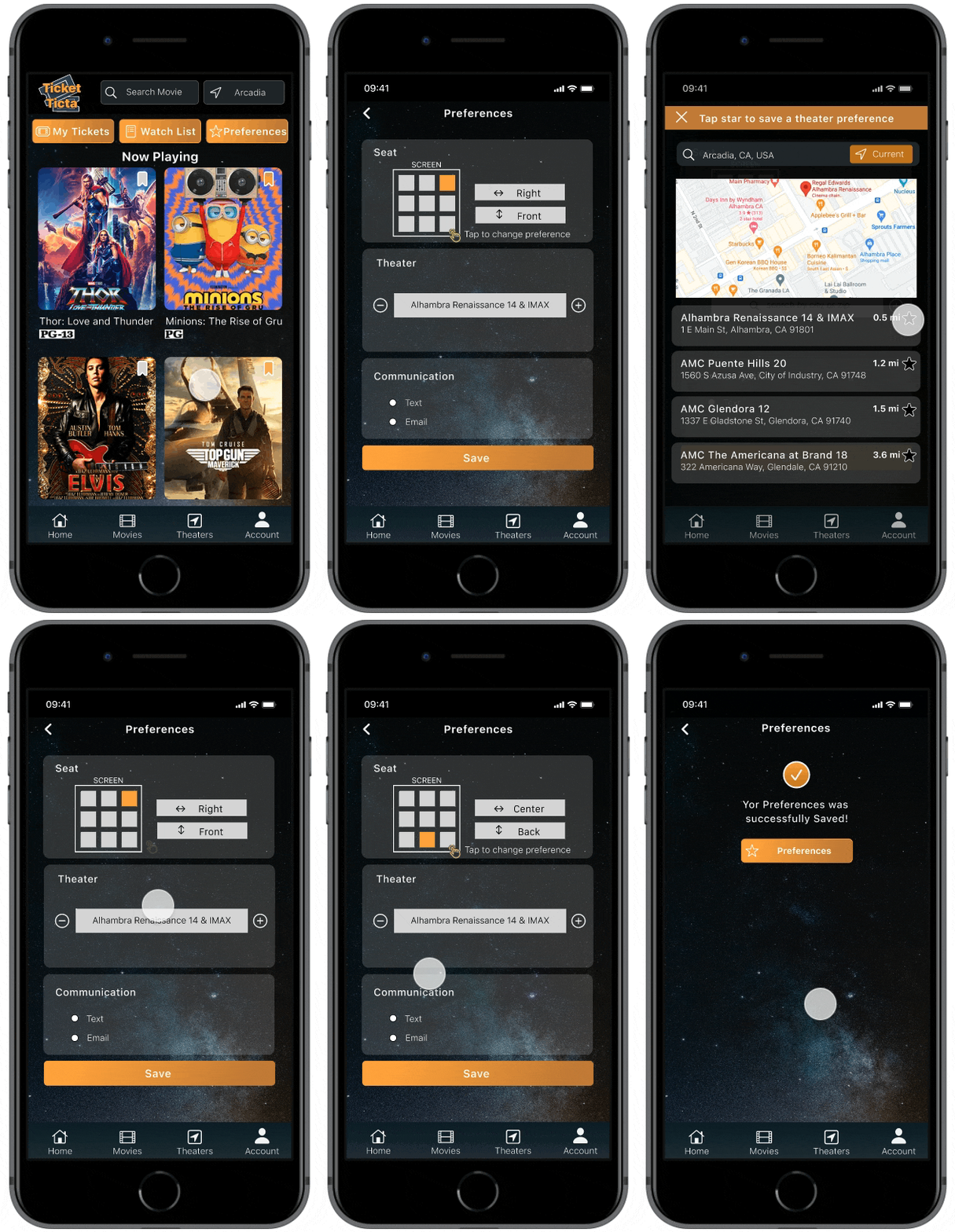
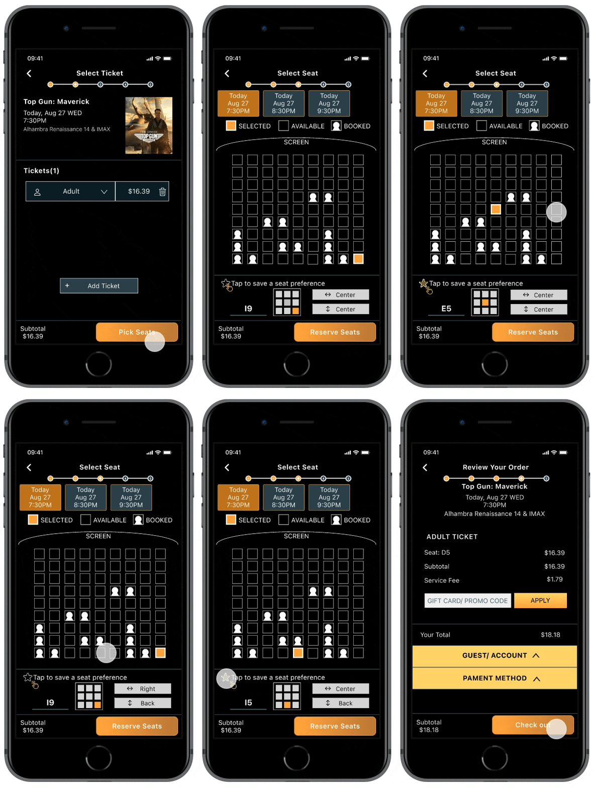
I was concerned that users might not understand how it works, so I created a UI animation here. The animation will show how to add a seat preference.
Results
Takeaways & Future Work
Learnings:
If it’s worth it to the user to do it, it’s worth it to the application to remember it.
Predicting what a user will do by remembering what he did last is based on the principle of task coherence. This is the idea that our goals and how we achieve them (via tasks) are generally similar from day to day.A thoughtful product goes beyond basic functions, prioritizing the goals and needs of its users.
Beyond merely fulfilling basic functions, a truly considerate product takes into account not only the practical requirements of its users but also their broader goals, desires, and preferences. It anticipates their needs, seeks to simplify their experiences, and strives to enhance their overall satisfaction. By integrating empathy and foresight into its design, such a product fosters a deeper connection with its users, creating a more meaningful and fulfilling interaction.Very few ideas are truly great.
This is why we need timely, candid feedback from capable collaborators, both among your core team and across the extended product team.
More features that can be implemented in Ticket Tictac app:
Virtual in-seat views
For pain point-users always spend too much time selecting a seat. I came up with building seat views or 3d views to see virtual in-seat views. When I looked into whether it was possible, I discovered that TickPick, a no-fee ticket marketplace based in New York City, had acquired Razorgator in 2018 and introduced a seat view feature. Putting aside the $40 million in funding that TickPick received, the Virtual in-seat views solution is fully optimized for mobile and integrated into the TickPick platform. In the end, I decided not to choose Virtual in-seat views as a solution because it is definitely expensive. But I can see it will really help users determine which virtual view directly from their seat they will have in order to provide the best experience possible.
More Interactive elements
Considering branding the application experience, using animations and interactive elements might be a good way. Also, add motion and transformations to the appearance of objects to indicate that an action is happening. Smooth out a startling or dislocating transition with an animation that makes it feel natural.
Customize seat defaults to users' liking
Allow users to add more details about personal preferences. For instance, users might prefer to choose a seat without someone seat beside or they prefer aisle seats better than middle seats. And if users are watching movie with a group, they'll have to consider not only their needs but also the preferences of their family members or friends.
